

I chose these projects because they represent my design style, growth, and creative ambitions. Each piece challenged me in a different way whether through branding, packaging, or conceptual design and helped me push my skills further. Together, they highlight the work I’m most proud of and serve as a reminder of how far I’ve come, while motivating me to keep evolving as a designer.
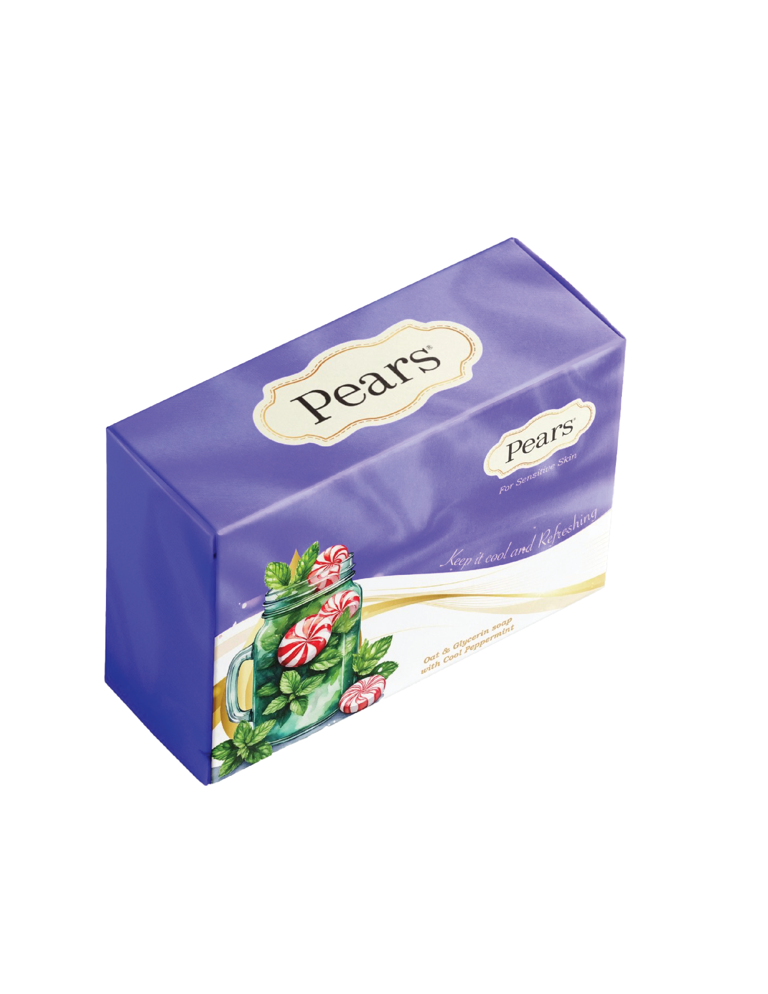
I served as the lead packaging designer for my group’s rebrand of Pears Soap. My goal was to create a look that felt classic and elegant while introducing a fresh, modern sensibility. I blended soft satin textures, floral elements, and expressive script type to evoke purity, luxury, and gentle care. The project let me merge my personal style with traditional aesthetics, resulting in packaging that feels both nostalgic and contemporary.
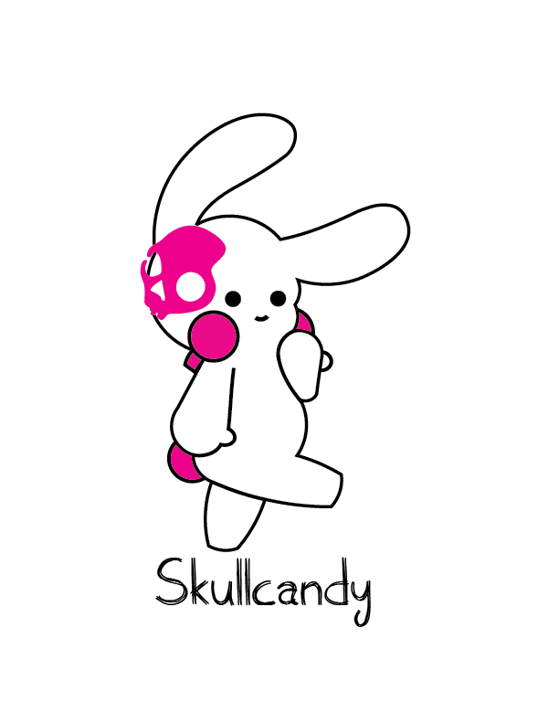
For my Advertising II class, I merged Skullcandy’s bold, edgy identity with the playful colors of spring and Easter. Centered on the message “Break Out of Your Shell,” the campaign celebrates individuality and self-expression. I blended gritty textures with bright pastels and created new brand characters, including a melty skull icon and Luna, an edgy bunny mascot. This project let me experiment with tone blending, character design, and thematic storytelling to produce a campaign that feels both energetic and on-brand.
 View project
Mizuki is a playful, Harajuku-inspired upcycling thrift store concept I created for my Advertising II class. I developed a whimsical, pastel brand identity that celebrates creativity, sustainability, and self-expression. Blending the bold, eclectic spirit of Harajuku with the purpose of upcycling, Mizuki encourages fashion that’s fun, accessible, and environmentally responsible. This project let me explore imaginative visual storytelling while building a warm and socially conscious brand.
I served as the lead packaging designer for my group’s rebrand of Pears Soap. My goal was to create a look that felt classic and elegant while introducing a fresh, modern sensibility. I blended soft satin textures, floral elements, and expressive script type to evoke purity, luxury, and gentle care. The project let me merge my personal style with traditional aesthetics, resulting in packaging that feels both nostalgic and contemporary.
 View project
I love helping people bring their ideas to life through thoughtful, fun, and effective design. If you have a project in mind (big or small!), I’m always open to chatting and seeing how I can help. Don’t hesitate to reach out!
Let’s connect: Kelvinhmedia@gmail.com Find me on Instagram & LinkedIn: @kelvinhmedia
© 2025 Kelvin Hernandez